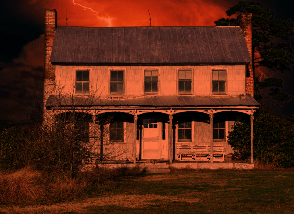
Every now and then, you’ll set a project aside that you thought was finished, leave it for a week or two, and come back only to spot a handful of elements you don’t like. That was the case for me with the House of Eden’s namesake. The original had some haloing around the house itself where I did my modifications, and the lightning in the sky was a little too faint. This I like better, and the slightly more orange hue fits the color palette I envisioned better. (More on the palette in the future). This will serve nicely as a proof of concept for future photo edits as I make my way along in the project.