The Lead-up.
A long time ago, I started playing with my initials in an attempt to see if I could find a fun way to sign my own name. I quickly found that when I put an E and a T right next to each other, the top bar of the first letter could form the top bar of the second, creating a line seamlessly between them. Being something like 15 at the time, I though “oh man, that’s awesome!” And started using it when I needed my initials for something, like my signature on any artwork I did.
15-plus years later, I decided that I wanted to 3D print a custom drink coaster for myself with something fun on it. I opted for my initials the way I had written them in my youth, simply because they were personalized for myself by default, and went to work printing. But I found that I disliked the old style: They were a little less elegant in this form than I would otherwise like, almost representative of the heavy-handedness of a teenager (which, you know, made sense) and as an added not-bonus, they were very square lines going on a very round base.
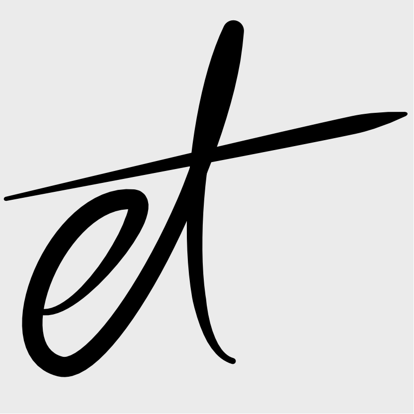
So I spent some time playing with the way I wrote those two letters: I played with the square look by refusing to draw a straight line, added my middle initials in a Roman-numeral-esque configuration, did an E with just a vertical line through it for the T, did a loopy-thing with lowercase letters–
Oh, hey, I like that.
So I refined my e and t a bit, tapping into my decaying cursive writing skills, playing with sizes for the e and the point of connection for the t’s bar until I found a shape I liked. From there, I took a photo with my phone and brought it into Affinity Designer, my vector image editor of choice, and made some scalable lineart for my project.
After I finished my printed coaster, I set the file aside for a few months until I started work on an interactive novel project (more posts on that in the future) and wanted a place to post the modified Creative Commons photos I was making for my illustrations. Without any ideas on where to begin, I busted out the lowercase lineart again and played around with various effects.
Creating the New Logo.
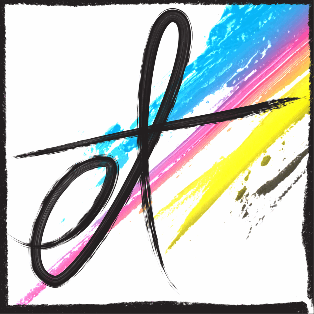
By itself, the lineart was just too plain, and had too much empty space in the bottom right side. These weren’t problems when I was designing my coaster, but I wanted this new design to look a little more professional. I played around with adding some loops or a smiley face in the lower right corner, but it was a bit too messy for what I wanted. I started playing around with line brushes to see if changing the texture of the logo would inspire anything when I happened upon some streaky, painterly lines and found my inspiration.
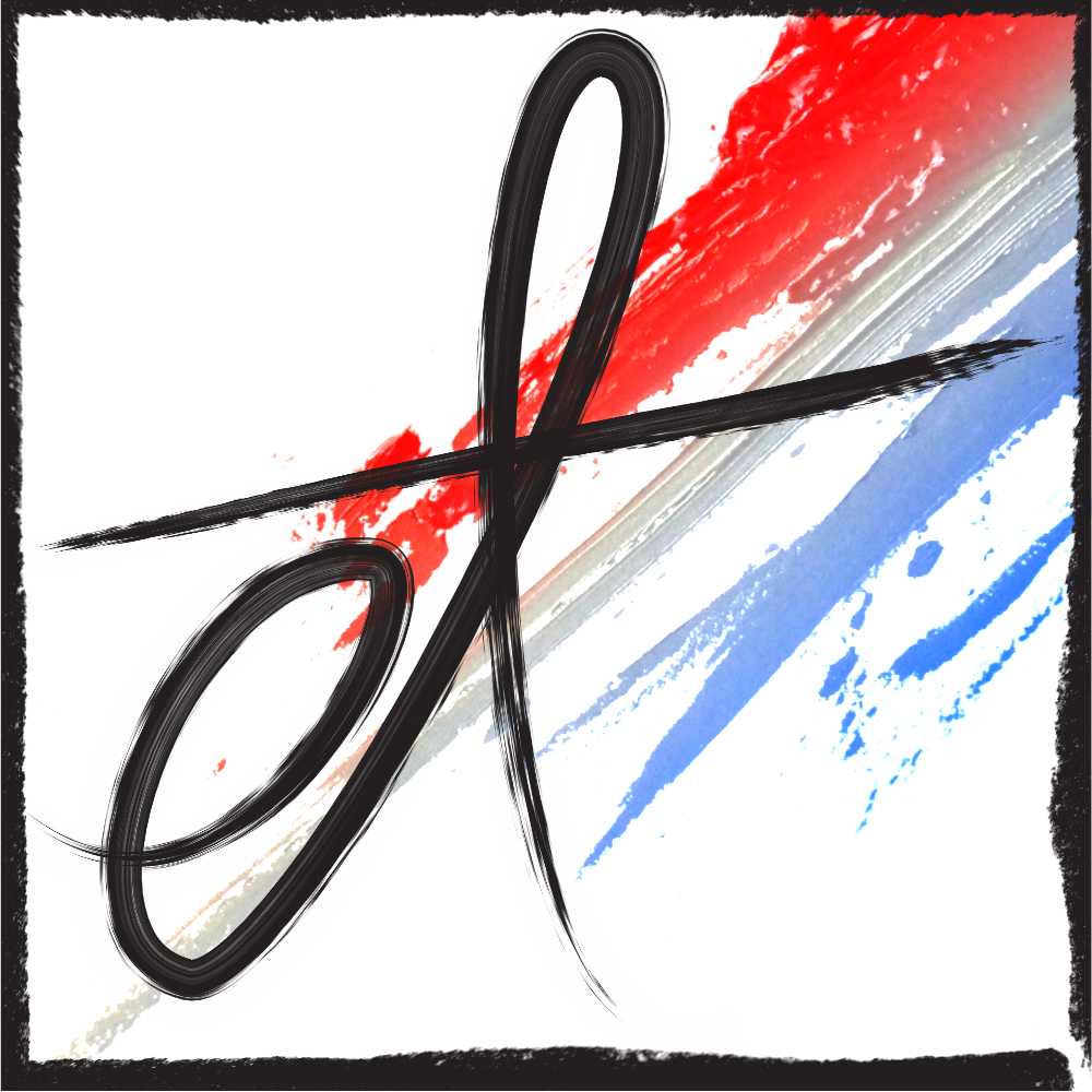
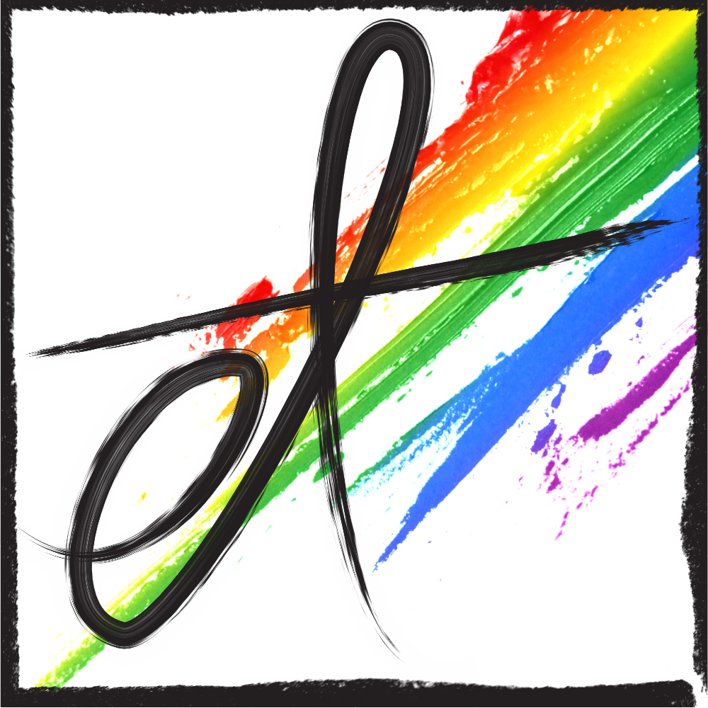
I opted to lean into the “messy artist” look by adding a background of paint streaks from some free stock photos, which also helped solve one of the other matters I had been mulling over: Color. I wasn’t sure up until this point what I wanted to use for my color schemes, but I realized I can use the paint streak effect as a wild card for any colors I want in the future. By default, I opted for the CMYK color quartet as a nod to my earliest jobs doing print work, but I can just as easily use any gradient or even solid color for special occasions.
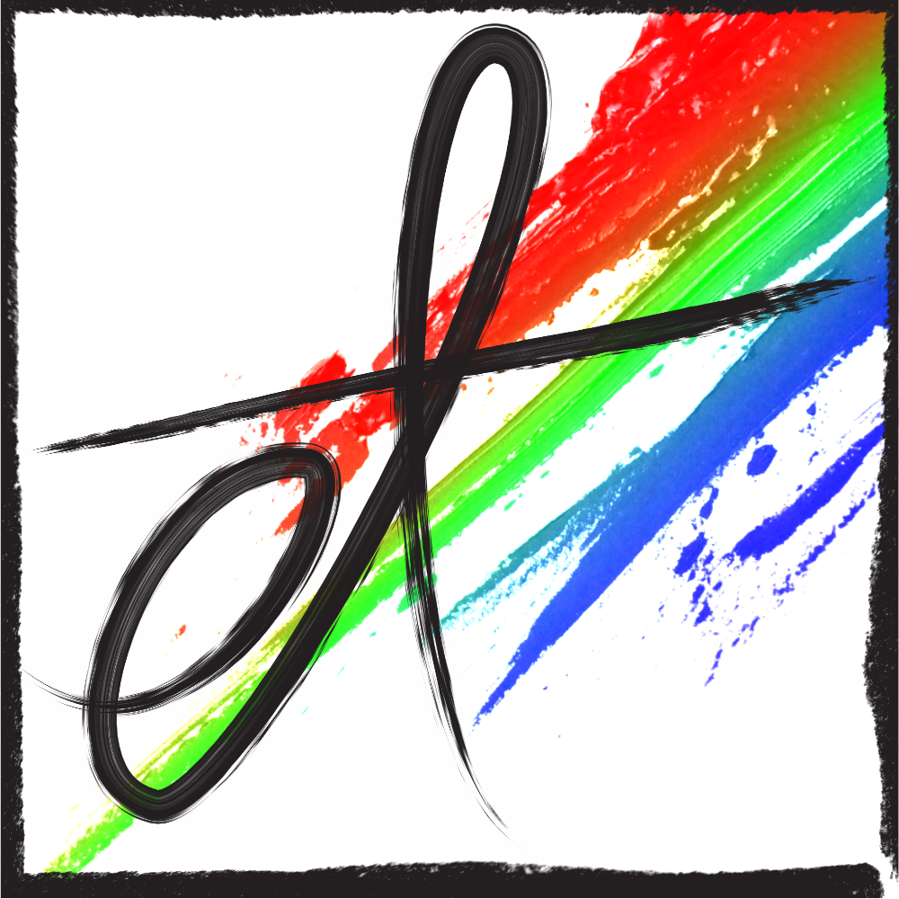
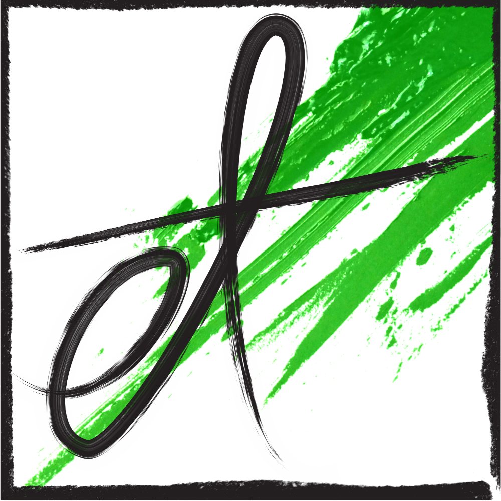
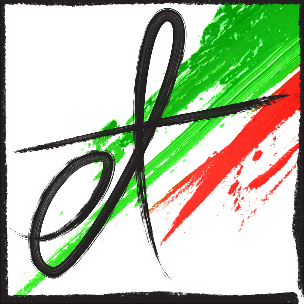
And there you have it! A new logo in scalable vector format* for me to use for all time or until I decide I want a new one, whichever comes first.
*Technically, this isn’t true since the paint streak is a stock photo, but it’s such a high resolution, it isn’t too big of an issue.